
DOYLE NEW YORK
IDENTITY • BRANDING
2015 - 2021
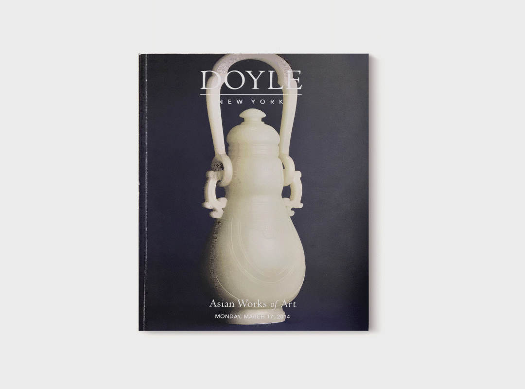
Doyle New York is a fine arts auction house based in New York since 1962. The company averaged over forty-five auctions a year, all accompanied by a printed catalogue In 2015, Doyle New York decided to rebrand their identity to a more refined and contemporary look by removing New York from their logos. The process began with a redesign of the catalogues, which was used as a template for the rest of the collateral in the company’s identity.

REWIND TO 2015
REDESIGNING THE CATALOGUES
Basically, iterations. Iterations. Iterations.
Here are some first-round variations of the catalogue redesign. Although there were favorites, the bolder design with the logo stretched from end to end was selected. It was unlike any of the competing auction houses.
